BakeCree
Helping point the arrow North for a new coffee brand.
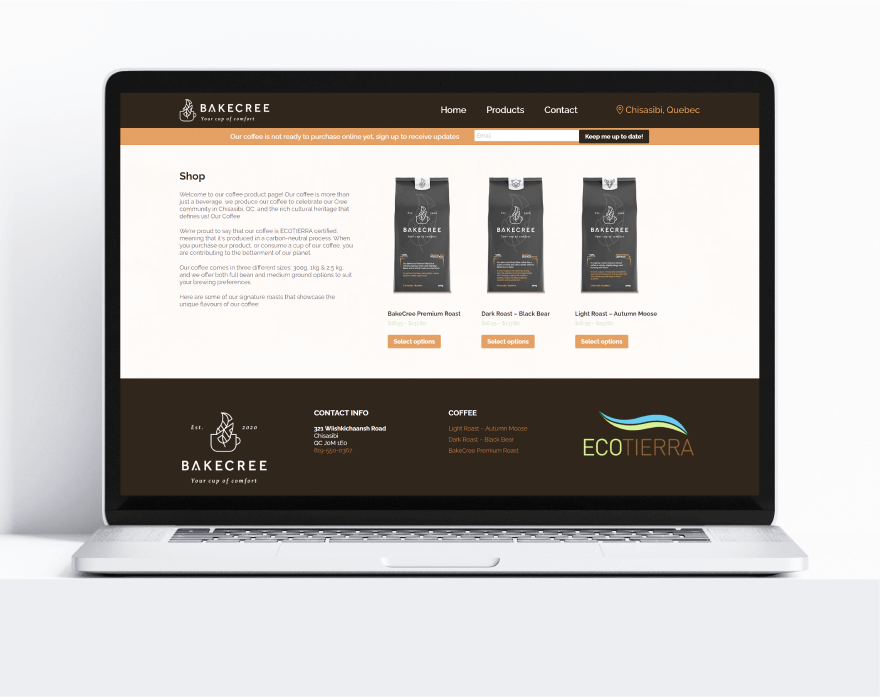
The coffee industry is a crowded market. Our goal was to help BakeCree stand out. We helped build them a new brand identity, product packaging, and marketing website, which ultimately helped drive their sales in Canada’s Northern market. BakeCree has now become a market leader in their geographic.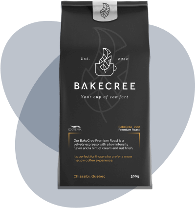
Strategy + Packaging + Branding + Collateral
The Challenge
BakeCree sought to get noticed and establish themselves as a Cree-owned coffee brand in Canada’s Northern market. Their original brand lacked a distinctive identity, making it challenging to differentiate themselves in a competitive industry.Our Process
To start capturing attention, BakeCree needed a new strategy. We tapped into the preferences of their audience and dove deep into research about their Northern market, so we could align our creative work with their business needs.We Delivered
Our team built BakeCree a new brand identity from the ground up. We also designed new packaging for their 3 different lines of coffee bean products, and brought it all together with a polished marketing website.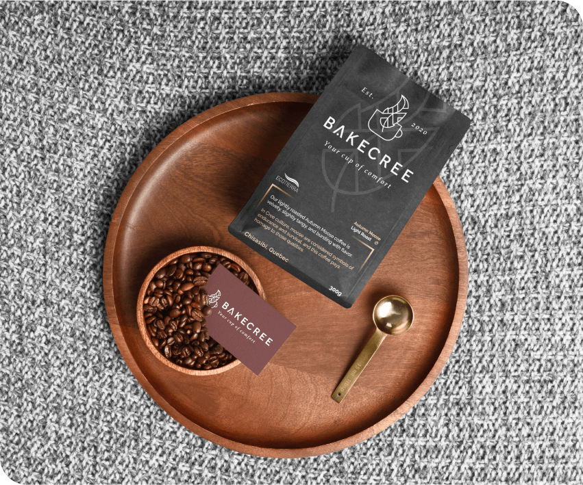
A Fresh New Look.
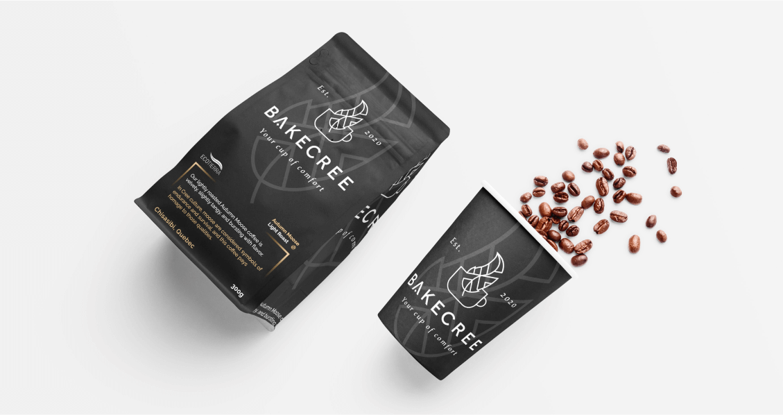
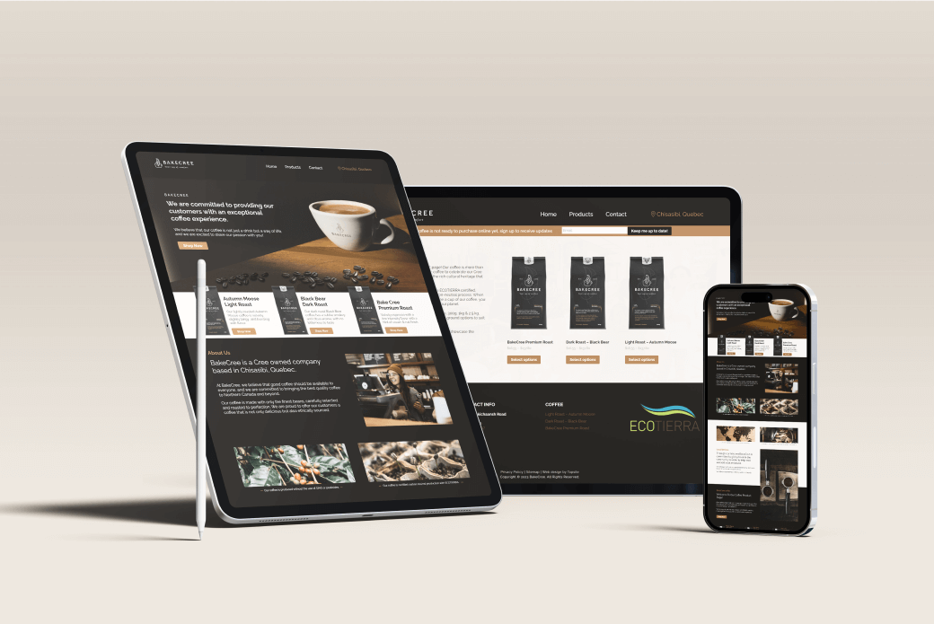
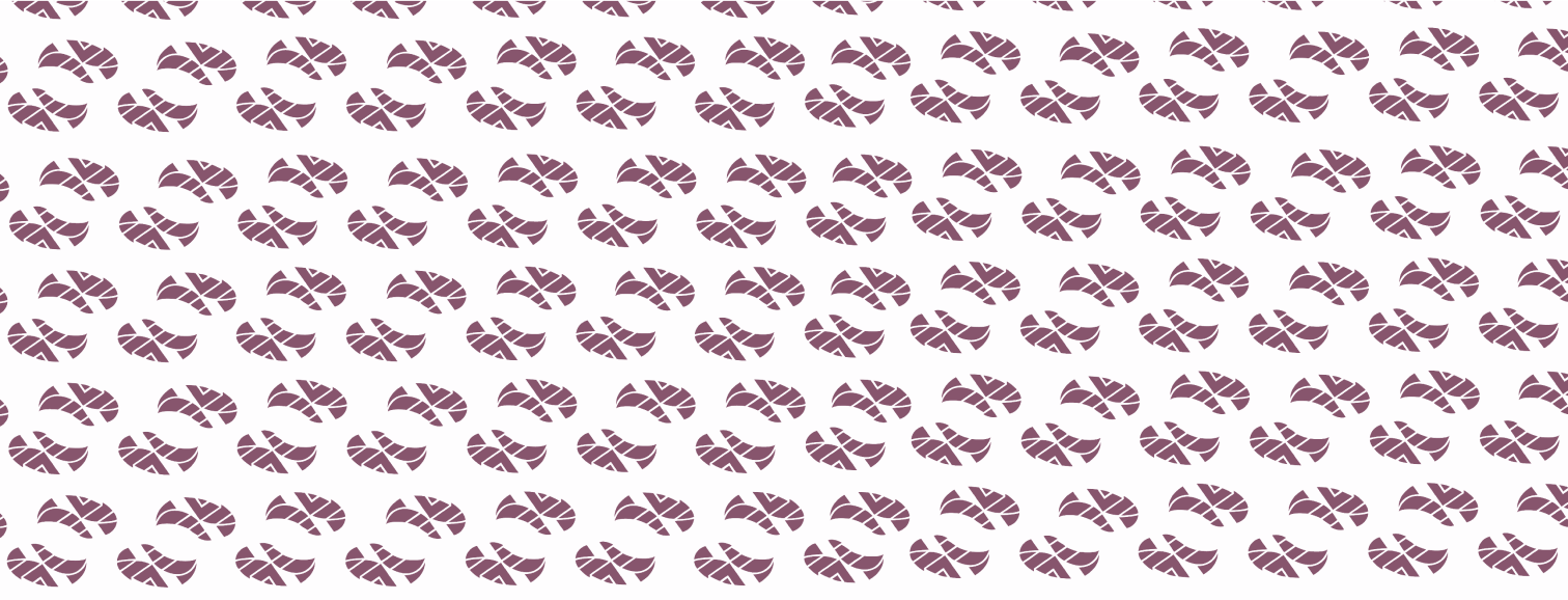
BakeCree’s new brand identity features warm, dark coffee tones and simplistic iconography. The new branding is displayed across all customer touchpoints, including the website and product packaging.
BakeCree
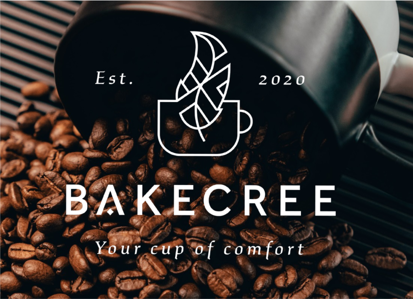
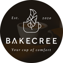
BakeCree’s simplistic typography and iconography are displayed in stark white over a dark background, like steam rising off a cup of warm coffee.; the leaf shape over the cup reinforces this concept. Hidden in the leaf is a Tipi shape, in honour of BakeCree’s Cree heritage.BakeCree Branding
BakeCree’s updated brand identity is simple and clean. It is cohesive, and can be applied across the website and other digital channels. Their new brand is polished and looks great on their coffee packaging and other printed materials.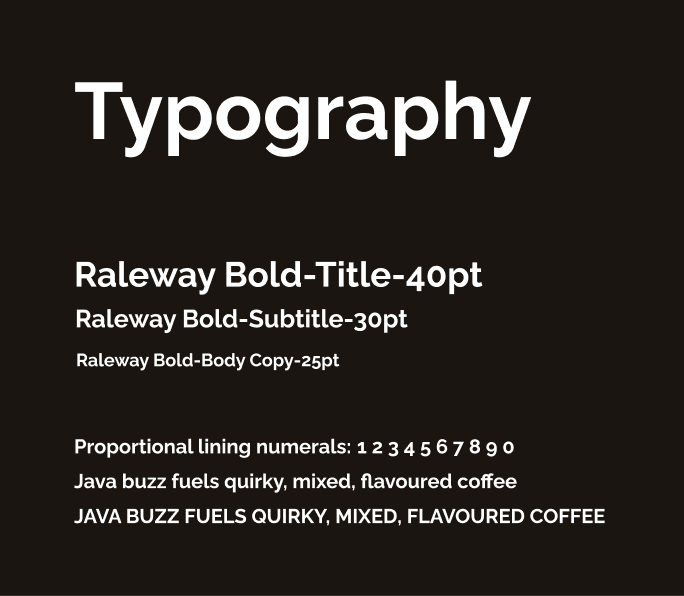
#EFE2D6
RGB 94,89,84
CMYK 0,5,10,5
#1A1510
RGB 10,8,6
CMYK 0,19,38,90
#AF6F33
RGB 69,44,20
CMYK 0,37,71,31
#4E2A2A
RGB 31,16,16
CMYK 0,46,46,69
Brand Pillars
BakeCree is focused on 3 main brand pillars:
1
Quality Coffee Products
2
Northern Identity & Focus
3
Supporting the Local Community
Brewing up a new website.
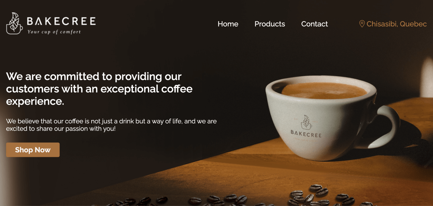
We developed BakeCree a user-friendly website which showcases their fresh branding and products in a more professional way. This website has supported their sales team as they pursue large distribution contracts across Northern Canada. E-commerce functionality has been built in and set up for when they’re ready to start pursuing the wider consumer market.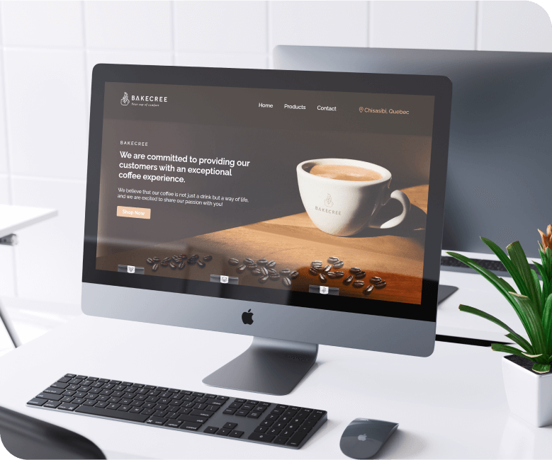
Packaging Work
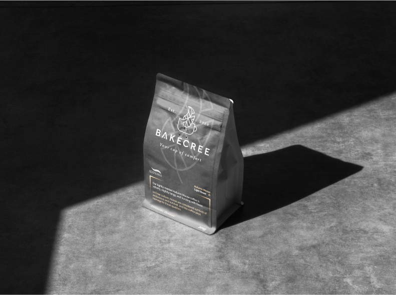
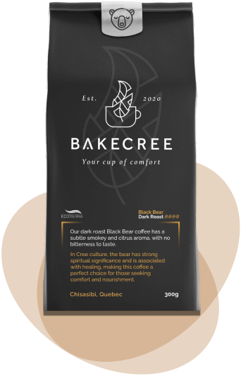
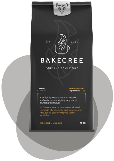
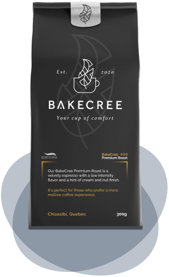
Our creative team designed concept mock-ups which included all of BakeCree’s specifications. We developed 3 distinct product lines to distinguish between their different roasts of coffee. The Light “Autumn Moose” and Dark “Black Bear” Roast blends were connected to Cree heritage through naming and custom iconography.Summary
Packaging work included developing clean and modern design for 3 distinct product lines. We tested multiple iterations of each design, ensuring we landed on the ideal look for BakeCree and their customers.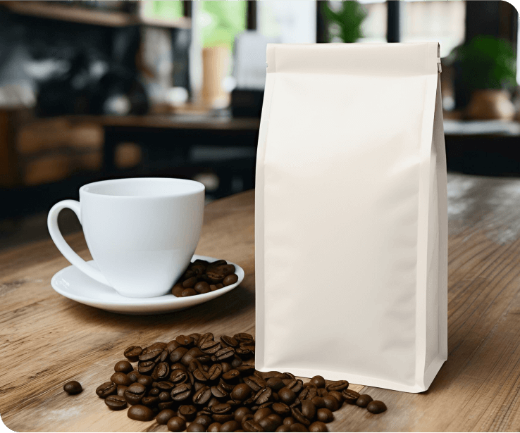
“We’ve been very happy with Topsite. Our website and packaging look great. The work they did has made my job so much easier and helped us to chase some big contracts. We’ve already asked them for help with another project.”
Gareth E.
Operations Co-Ordinator • BakeCree
Other Works


